Sunday, January 17, 2016

What is the volume of water in a few inches of rain?

Over the course of the week here in Southern California (USA), we have been inundated with rain fall -- which the weather service attributes to a large 'oscillation' of temperature in the ocean called "El Nino."  Regardless of the name of the storm, the water is much needed according to various news and State regulation agencies with all of the talk (over the last year) about 'droughts' and 'water shortages.'  What struck me about all of the reporting was that I have had a new found appreciation for numbers (in inches) reported of rain fall over a given geographic region.  To understand my new appreciation, I will have to go into a brief (could be a little long) back story which occurred over Christmas vacation.  Of course, the results of this tangent are very relevant and might shed light on all of the reported volumes of water reported in the news regardless of the season -- drought or heavy rain fall.


Volume Of Rain Flowing Down The LA River


I start with the question: How much rain is flowing down the LA river?  The reason why I chose this question in particular was due to a couple of recent news items sent to me electronically by friends.  First, a friend posted a video on Facebook shown below:


Below the video in the notes the following message appeared regarding the video:


Is the California drought a scam?

"An inch of rainfall in L.A. generates 3.8 billion gallons of runoff, so you're talking about more than 12 billion gallons of water that could be captured, but that flows within hours down our concrete streets and into the ocean. There’s enough rainwater to be harvested to produce 30-50% of the entire city’s water needs."

"About half of the rainfall flowing down the Los Angeles River in a typical storm is lost to the ocean, according to the Water Augmentation Study from the Council for Watershed Health, a L.A.-based environmental organization. Most of the rainwater that bounces off roofs, parking lots, streets and sidewalks ends up in storm channels that flush rainwater into the ocean. That amounts to 10  billion gallons from an average rainstorm, enough to fill 120 Rose Bowls, said Alix Hobbs, president of Heal The Bay."


I have to admit, the video is not exactly the same video that I saw on Facebook.  Still, the video appears to be very similar and to drive home the point of water just flowing out to sea.  The posts on Facebook are labeled with concerns about 'wasted water.'  Of course, the problem here is that the water is dirty and would need to be treated downstream and purified to be of any use to residents.  With the exception of watering crops possibly (maybe).


The point is: the video above shows a massive amount of water due to just a couple of inches of rain fall.  A statistic of 10 billion gallons is reported by the author above.  Is this really correct?  Can that much rain be falling from the sky and equate to a couple of inches of rain?


In a recent Los Angeles Times article titled "El Nino Rains Get LA Rivers Roaring To Life" the author reports an extremely large magnitude of volume of rain that is attributed to the El Nino storm.  A video is attached to the article showing the flow of water down the LA River.  I would recommend watching the 30 second video before continuing to read. The reported large volume is reported as a function of flow rate:


The river at its peak can move 146,000 cubic feet of water every second. At its normal rate, the Colorado River, sculptor of the Grand Canyon, doesn't do a quarter of that.


 In the future, I will understand why reporters love to cite volumes in 'cubic feet.'  For now, we just need to understand how many gallons/second is that equivalent to?  The first calculation that I will perform (or show) will be the conversion of the 'flow rate' of 'cubic feet/second' to 'gallons/second.'  I can think more clearly using units of 'gallons' rather than cubic feet.  Below is the conversion:
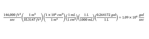


Next, I asked myself, how long at the flow rate would the river have to flow in order to equal 10 billion gallons.  Here is the calculation below:


Just over 2.5 hours -- Wow!!! That fits nicely with the values reported in the video notes.  Meaning, that if water is flowing down the LA River, accumulating 10 billion gallons is not inconceivable.  Not in the least.  Of course, the flow rate used for the calculations is based on the 'maximum' speed recorded of the LA River in history.  Regardless, the important message is that given enough time, a large amount of water flows down the river -- which would call into question the need to scare the public about droughts in California.  I realize that the water is not usable directly from the river.


You might be wondering why I am thinking about the subject.  I mean, aside from the recent storms that have hit Southern California over the past week and a half along with the blaring news bites about 'El Nino'.  Part of the answer lies in the fact that I had large amounts of water on my mind when writing the earlier post regarding the flood in Brazil as a result of a damaged dam due to mine waste water.  The other part is due to news which I received over the winter break visiting family.


How Many Gallons Of Water Equals 2 inches Of Rain?


Over winter break, we got together with family.  Getting together means talking about current events.  One current event was the rainfall that was hitting the Lake Tahoe region.  The reason being is that my brother-in-law's family lives up near the lake.  Each year, my sister and her family go and tear up the ski slopes for a few days.  Therefore, their interested in storm reporting in the region.


Anyways, during a conversation regarding the weather up in the region (Lake Tahoe), I heard a number which blew my mind.  I almost thought that I had a hearing issue.  I asked for clarification and sure enough, I had heard correctly.  The number in question was the amount (volume) of water that filled up 1.92 inches in Lake Tahoe was equivalent to 63 billion gallons.


At first, I did not believe this number to be correct.  In fact, had I not previously been entertaining the number (15.9 billion gallons) which was equivalent to the mining spill in Brazil, I really would have thought my family to be insane.


When I got home, I immediately looked up the number.  Sure enough, according to the news site 'KRON,' a heavy storm dumped enough rain to add 60 billion gallons of water into Lake Tahoe.  Here is a 'tweet' that I found on the new sites Twitter account shown below:


After finding the tweet shown above, I just still could not wrap my head around the gigantic volume of 60 billion gallons correlating to just 1.92 inches of rain.  I would believe more height to be associated with that volume.  Why did the volume bother me terribly?  I guess because I had not yet checked the number with a calculation of my own.


First, I think a little perspective might be needed at the moment to visualize this massive amount of water.  If you have never visited Lake Tahoe, then the volume of water contained in the lake is truly unimaginable.  The shoreline perimeter is 72 miles around the entire lake.  One can even see the lake from space.


With the information about the LA River along with the image above, the volume reported does not seem outlandish.  Although, at the time that the number of 60 billion gallons was reported to me, all of the above information had not been known to me.  I had to do a small amount of research -- which is part of this post.  


In fact, when we (you and I) hear or see statistics, we should not just take them at face value and believe them.  A small amount of research can go a long way -- as you will see shortly.  Without knowing much, how could a person check to see if the number was correct?  


How can the volume be determined knowing the value of both perimeter and height?


Well, knowing the value of the perimeter in miles allows us to carry out an approximation to determine the volume.  We could approximate the lake to be a circle and then figure out the volume based on an equation for a cylinder.  Below, I show the approximation I made initially to do a 'rough check' of the reported number.
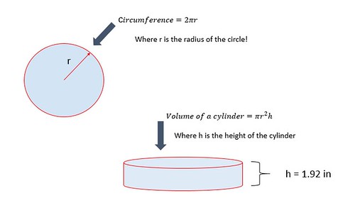


In the picture above, a circle is shown with a 'circumference' (as "C" equal to 72 miles -- perimeter of Lake Taho) which is equal to a factor of 2pi multiplied by a 'radius'.  Since the 'circumference' is known, the 'radius' can be determined through rearranging the equation -- as shown below.
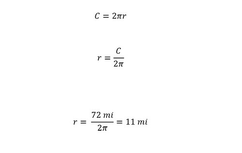


The calculated radius is expressed in units of 'miles'.  In order to calculate a volume of a cylinder with height expressed in units of 'inches' then the radius must be converted from 'miles' to 'inches' as shown below:


With the radius known, the next step toward figuring out the volume of rain that correlates to the 1.92 inches of rain that was deposited into Lake Tahoe is to use the equation for the volume of a cylinder.  In the same picture with the circle, there is an equation for the volume of a cylinder.  A factor of pi squared multiplied by the radius and height gives the total volume of a cylinder as shown below:
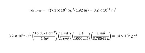


The volume is expressed in 'units' of cubic inches -- which might not be useful for most people.  Unless, of course, you think in terms of cubic inches or cubic feet, etc.  To each his own!  I am more comfortable with gallons and since the article cites water volumes in gallons -- we will stick with that unit.  Therefore, below the equation for the volume, I converted the volume expressed in units of cubic inches to units of gallons using dimensional analysis.


According to my approximation using a circle, the answer (for volume) is short compared to the value reported by the news (KRON) of 63 billion gallons.  Why?  Ask the following questions:


1) Is the 'run-off' water from surrounding region (the mountains) the difference in volume?


2) Is the approximation of a circle that far off?


3) Is there a more accurate way to calculate the volume?


I had these questions after calculating the differences in volume.  One of the most powerful advantages of having access to 'social media' is the ability to ask questions.  I decided to inquire into the difference between the number I calculated and the reported number.  In order to inquire into the difference, I had to find out where the number (reported number) originated.


-Transparency in reported numbers is needed


I started looking into the origination of the reported number of 63 billion gallons of water that was supposedly dumped into Lake Tahoe.  What I found was very interesting.  You might find the answer to be drawn out, but that is how research is done on a everyday basis.  Why should investigating the source of a 'reported value' be any different?  The methodology is the same as shown below.


First, I found an interesting article upon investigating further the source of the volume of 63 billion gallons of water which differed from the original value.  The 'SF Gate' reported a number far less than either the original value (63 billion gallons) or our calculated value (14 billion gallons).  Their value was based on a 'correction' of 6.3 billion gallons.  Wow!  The difference being nearly 57 billion gallons from the original value and half of our calculated value (14 billion).  What is going on here?


I decided to turn to social media (Twitter) and ask KRON about the difference in values as shown below:
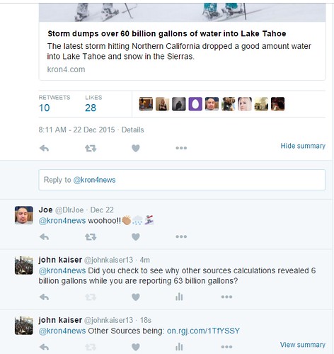


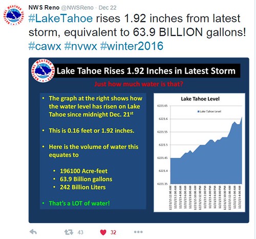
Shown above is the inquiry to which I have yet to receive an answer from KRON for.  I decided to find out where the news organizations got the source from.  After searching into the twitter accounts of both KRON and SFGate, I found that the source originated from the National Weather Service -- Reno office.  Finally, I found the source on their Twitter feed shown below:


Above the tweet is another correction to the original reported value shown below:
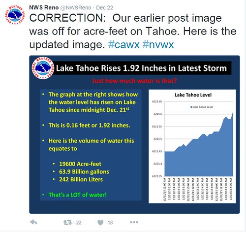


The correction was to the value reported in "Acre-feet".  I wondered if another correction would be issued for the value reported in 'gallons.'  I decided to ask the NWS Reno by tweeting to them as shown below:
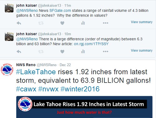


I included the article reporting the difference in volume -- which was significant -- below:



I waited for an answer and expected one.  Not really.  Although, a few news agencies are good at getting back to an inquirer quite quickly.  Therefore, if you have a question, go ahead an ask someone via 'social media'.  You might be surprised at the ability to get a question answered.  Since the question above was to a government agency, my expectation was low.


A few days later, I was pleasantly surprised when an employee from the National Weather Service at Reno responded to my question on Twitter.  Shown below is the response:
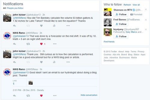


The forecaster that performed the calculation was Tim Beardsley from the NWS Reno.  As indicated above, the initial value that was calculated was off by a factor of 10.  Meaning, that the true number was 6.3 billion gallons of water NOT 63 billion gallons of water.  Additionally, you can see that I still asked to see the equation or method that Tim used to calculate the value.  I was left still unsatisfied.


Surely, I should be able to calculate the value to within the same 'order of magnitude'.  At this point in time, I had to wait for another response.  Keep in mind, this correspondence was occurring over the holidays.  I was surprised that any responses were given.  The first week in January, Tim Beardsley responded with the method that he used to calculate the volume of water into Lake Tahoe corresponding to 1.92 inches of rain fall.  Shown below is his response on twitter:
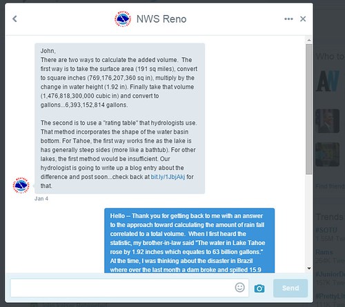


After reading his response, I could see that his method was simpler.  I did not realize that a value for the surface of Lake Tahoe was known.  I felt rather stupid -- brain fart.  Of course, use the area of the lake and then multiply that value by the height -- as shown above in the equation for the volume of a cylinder.


To verify his calculation, I repeated exactly what was reported above in the tween response.  I show the results below:


As you can see, the calculation is easier than our approach.  The calculation is simplified by having the 'area' -- which is equal to (pi multiplied by the radius squared).


Still, the question remains where the difference of almost double the volume comes in.  I imagine that the difference is due to the calculation of the perimeter distance.  Or that Lake Tahoe is not a perfect circle.


Conclusion


Regardless of the true value reported here by the news organizations, a few observations can be made in conclusion:


1) Do not take a value reported by the news as to be 'absolute truth'.


2) Different methodologies of calculating volume can give VERY different answers.


3) Different answers have VERY different meanings.


Again, no one is perfect as shown above.  There were two considerations that were not discussed in the blog post among others (I am always open to suggestions).  The first was that in the corrected twitter post by the NWS Reno, the value of 'acre-feet' was off by an order of magnitude.  A large difference exists between 196,100 acre-feet and 19,600 acre-feet.  How large? Exactly 176,500 acre-feet.  How did that difference arise during the calculation?


The second consideration was that there exist a second method by which to calculate the total volume of rain fall by hydrologists.  According to the explanation above from the NWS Reno, a 'Rating Table' is used by hydrologists (click here).  Regardless, a greater degree should be a goal of the National Weather Service in Reno regarding the method of calculating weather conditions.


A few readers might not agree with the last statement regarding organizations being more transparent with their methodologies.  Ask yourself the following question:


How many times have you looked out the window after looking at the weather forecast and said "Wow, the weather channel really got that wrong?"  "I wonder how the weather channel came to this conclusion?"  This should warrant a greater degree of transparency -- for those interested in understanding the methodologies used.


As I have shown above, the amount of rainfall that drops on Southern California is quite large.  Not just quite large, but HUGE.  Scientists and engineers should be trying to come up with methods to capture this water for alternative methods.  Or at least building 'floatable turbines' or another method to turn the mechanical energy (the energy of flow of water) into electrical energy.  What do you think?  How would you harness that power?  Until next time, enjoy pondering the numbers reported in the post.  Have a great evening.

Wednesday, January 13, 2016

What do a coffee coupon and an outfit have in common? A Feeling!

At first sight, the title might be simple and suggest that the two are simply correlated by a feeling of using a coupon while shopping for an outfit at a department store.  Am I correct?  Did I read your mind?  Alright, I will not quit my day job as an instrument manager at a university.  The subject of this post emerges every test season on the campus that I work at.  How, you might ask?  From here on out throughout the post below, I will refer to 'final exams' as 'test season' in order to be succinct.  Just today, I found a correlation between a coupon and a choice of one's apparel during 'test season.'  To learn more, read on.


There is no scientific basis for the proposition or conclusion that I draw.  The subject matter is purely speculative and based solely on observation.  I am not the only person who has drawn a similar conclusion (which I will explain shortly) on the matter.  Although, I thought that by writing about the trend, then maybe a few readers might comment and educate myself and others on the conclusion that I draw.  Alright, here we go...Lets talk about the correlation between the three different subjects: fashion, coupons, and 'test season.'


Observation 1: Reward Feels Great!


One of the staples of any university campus is a coffee shop on campus.  We have four shops on campus.    All four are the same and branded as the "Freudian Sip."  Additionally, each have a benefit system that is tied together across campus.  One benefit or reward system is a 'rewards card' -- which has a certain number of tabs or markings that represent a single purchase.


These are ubiquitous in society today. Every place I make a purchase, I feel like I am being asked "Do you have your rewards card?" Anyways, after a certain number of purchases, the customer gets an product at discount or free. In the case of coffee, the eleventh coffee is free after ten purchases!


The other reward system is in the form of 'human advertising' i.e., a t-shirt.  Each shop sells a t-shirt for around $10 dollars.  Upon ordering a coffee drink of your choice, a 20% discount is given if the customer is wearing the shirt.  A few customers can be seen 'donning' the shirt upon arrival at the coffee shop (just around the corner) in order to receive the discount.  Coffee drinkers take their discounts very seriously.


I am of the first reward system variety -- which is to say, I have a rewards card which I get stamped (or a hole punched) signifying that I have purchased a cup of coffee -- and am working towards receiving (after 10 purchases) a free drink of my choice.  At this moment, you might be asking yourself the following question:


Where is he going with this line of thought?  Anywhere?


Fair enough...Yesterday, I went to get my cup of coffee in the afternoon.  The manager and I struck up a conversation which went tangentially in all directions from topic to topic.  One topic that we stayed on for quite a long time -- during our 5 minute talk (hilarious) was that of redeeming or using the coffee rewards card on campus for coffee.


He described a strange observation with customer and reward cards for coffee purchases.  Actually, he reported on a trend which has occurred over the last five years during his employment on campus.  He said that the most popular times of the year for customers to redeem or cash in on their reward cards is during 'test season' (final exams).  At first, I did not think anything of his observation.


Out of respect, I asked him a clarification question regard the type of customer...Is the trend occurring mainly with students or staff?  There is a reason why I asked this question (without even knowing).  He confidently said that there is a definite increase in students during 'test season.'  Our conversation ended there -- because I had to get back to work.  Unbeknownst to me, in the back of my head, the wheels were turning grinding through the manager's observation and my polite but curious question.


The answer to the reason is the same answer to the subject of this blog post.  How are a coffee coupon (or reward card) and an outfit related?  To answer this, I need to tell you about observation number 2: fashion.  Read on...


Observation 2: A Nice Outfit Feels Good


Yes, I have been told by my friends who have a shopping addiction that wearing nice clothes 'feels' provides a sense of feeling great.  I am not of that variety.  Although, when I do get dressed up, I feel good -- usually because of the occasion and not the outfit necessarily.  But 'to each his own..'!!


I have noticed a trend across campuses that I have either attended or worked at that occurs during 'test season.'  At first I did not tell anyone (very frequently) of this trend, until one day my wife (who teaches chemistry) commented on a similar observation.  What observation might that be?  Here is the observation.


Go to any university campus during the 'test season' (final exam week) and undoubtedly, you will notice three types of outfits: (1) Normal (nothing unusual), (2) Pajamas (Bedtime attire), and (3) Decked out (dressed up).  At first, I thought that I was just crazy and constantly asked myself why was I noticing these three types of outfits on students during this week.


Lone and behold, the answer might have appeared.  My wife and I were walking on campus last year.  A lady walked by and had an outfit on that appeared like the lady in the picture below:


Source: http://daintygirl.ca/wmcfw-narces/


Or an alternative outfit might look like this lady below:


Source: http://hair.allwomenstalk.com/hair-trends-for-spring/5


There is nothing particularly wrong with these two outfits.  The dress code is great if a ladies were going out on the town or to lunch, etc.  But wearing the above outfits to an exam seems like a student has spent a considerable amount of time on their outfit rather than on their exam preparation.  (Just an opinion -- I am open to being wrong).  Here is my wife's opinion below.


She is even tougher than I am on other women.  This is a phenomenon which I do not understand since I am a male.  Nor do I need to understand.  I will just keep being a simple male.  She contends that students who dress in the outfits above are giving off the following impression: 


I am on my way to a final exam right now.  I know that I did not study enough and probably will fail.  At least I will fail looking fabulous!  


To tell you the truth, I had never thought of this.  Again, we are two separate scientists and have two separate observations.  I can agree now that I have heard her observation that this appears to be true.  How do I know?  Well, without giving away any data on students test scores, I have seen some correlation with the students who have been in a few classes (that I have taught in graduate school).  I was so happy to hear this observation from a woman (my wife).  As I guy, I did not know how to express this with words.  


Again, right about now, you might be asking yourself the following question: 


Where is he going with this post?  A tangent, on top of a tangent....WOW!


Conclusion:


I know that you did not expect me to jump to the conclusion so quickly.  But a detailed discussion is not needed.  Here is a summary of the observations above:


In the first observation, there is an increase in students 'redeeming' or collecting on their rewards during a stressful week of exams.  The overarching thought or motivation might be some unconscious thought of wanting to 'feel good.'  During stressful times, getting a 'deal' or a 'free coffee' -- especially, a 'free coffee espresso' drink -- which can cost on the order of $6 -- $8 is a nice feeling.  The local feeling of receiving an award might offset the uncomfortable stressful feeling of exams.


Similarly, in the second observation, dressing up and looking good does feel great.  No one is here to dispute the feeling.  Although, there is a time and place to do so to fully realize and reap the benefits.  During exam time might not be the best time to do so.  Although, if the test is going to be a 'failure' -- again -- that local feeling of looking 'fabulous' might be enough to offset the stress of final exams.


Finally, as I mentioned early on in the blog post, this is purely speculative on the part of two chemists.  Although, we are open to suggestions and comments on changing our thoughts on the subject matter.  


I thought that I would write a post that is a little different than my usual 'dimensional analysis' posts that have appeared thus far to give the reader a break.  Even scientists don't just spend their time thinking about numbers and equations.  We look at fashion too and occasionally dance as well.  Have a great day!


Saturday, January 9, 2016

How much energy is contained within a 'kiloton' of energy? i.e. a small nuclear weapon?

Last week, North Korea announced that a successful nuclear test had been conducted.  Initial accounts of the magnitude of the weapon included distinguishing the weapon from the bomb that was dropped on 'Hiroshima' 70 years ago.  CNN initially reported that the weapon was a Hydrogen Nuclear Bomb (a fusion weapon -- a fusion reaction) as opposed to a 'fission' weapon.  The main distinguishing fact (a number representing the magnitude of the blast) was that a "Hydrogen bomb blast is equivalent to 13,000 tons of TNT".  How much energy is contained within 13,000 tons of TNT (trinitro-toluene)?  That is the question that occupied my mind while later news accounts gave more accurate comparisons to reach the conclusion that the nuclear test was in fact a smaller 'fission' bomb rather than "H Bomb."


How much is a kiloton of Energy?


Regardless of what type of weapon was actually set off, I thought that an exploration into the amount of energy contained with a 'kiloton' of energy would be interesting.  Over the decades, several reports of the threats of nuclear weapons have occupied news reports.  I wonder how connected the public is with the threat of a given nuclear weapon.  Part of the disconnect (I believe) stems from a lack of understanding of the energy contained within a weapon.


I thought that I would start with a 'small size' nuclear weapons that is on the order of 'kilotons' of energy.  As described above, the news reported a distinguishing value of 13,000 tons of TNT.  The value of 13,000 tons is referred to as '13 kiloton' -- which is equivalent since the prefix "kilo-' is a thousand.   A 'kiloton' of energy can be defined from 'Wikipedia' as the amount of energy released in an explosion of a ton of TNT:


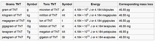
TNT equivalent is a method of quantifying the energy released in explosions. The "ton of TNT" is a unit of energy equal to 4.184 gigajoules,[1]which is approximately the amount of energy released in the detonation of a metric ton (1,000 kilograms or 1 megagram) of TNT. The "megaton of TNT" is a unit of energy equal to 4.184 petajoules.[2]


Additionally, in the 'Wikipedia' article for 'Kiloton' a table with conversion is given that shows how many Joules of energy are equivalent to a ton of TNT.  Here is an image of the table 'borrowed' from 'Wikipedia' shown below:


How does one makes sense of the values reported in the table above relating the tons of TNT to Joules?


I could find objects or quantities and compare the power or energy needed to operate them to the value of 13 kilotons.  Lets see -- below.


How does 13 kilotons compare in magnitude to other values of energy?


In order to understand the amount of energy, I will use 'dimensional analysis' to compare the amount of energy to three quantities: (1) Annual power consumption in Los Angeles County, (2) Amount of miles powering a Nissan 'Leaf' (2016 Electric Vehicle), and (3) Amount of time that can power a ceiling fan.


Starting off, I will ask the following question:


How does a 'kiloton' of energy compare to the amount of energy required to power the county of Los Angeles for an entire year?


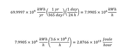
In order to answer the above question, the amount of power required to run Los Angeles County would have to be known.  Where does one find the amount of power required to run Los Angeles County in a given year?  The answer is the "Electricity Consumption Data Management System."  Upon choosing a year and county -- in this case "Los Angeles" and "2014" -- the amount is given in 69,997 million kWh.  Or just say, 69.997 billion kiloWatt-hours.


What is the conversion of 'kiloWatt-hour' to Joules?  Both quantities need to be expressed in the same units -- Joules or J.  In order to convert to different units, the relation of the Joule to the 'kiloWatt-hour' is needed.  There are many reference books with conversion tables available online.  I like to resort to the easiest route first.


A kiloWatt-hour is defined by 'Wikipedia' as:


The kilowatt hour (symbol kWh, kW·h, or kW h) is a derived unit of energy equal to 3.6 megajoules.[1][2] If the energy is being transmitted or used at a constant rate (power) over a period of time, the total energy in kilowatt-hours is the product of the power in kilowatts and the time in hours. The kilowatt-hour is commonly used as a billing unit for energy delivered to consumers by electric utilities.


Converting a kiloWatt-hour to Joules of energy -- the power required for an hour is shown below:


But wait, where did the "3600 s" come from?  Here is the conversion of an hour to seconds:


With a conversion factor in hand to convert from a 'kiloWatt-hour' to a Joule, I can start to determine the comparison of the annual power consumption of Los Angeles County to the energy contained in a 13 kiloton nuclear weapon.  To start


In the first line, I took the annual power consumption of Los Angeles County (expressed in billions of kiloWatt-hours) and converted that to kiloWatt-hours per hour.  Next, I calculated the number of Joules per hour that are equivalent to kiloWatt-hour per hour -- in order to do a direct comparison (same units of Joule).


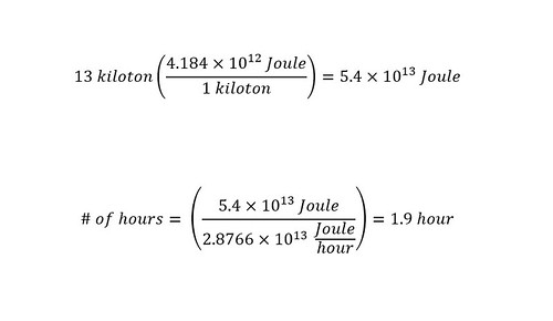
With both quantities expressed in Joules, a direct comparison can be made and the number of hours can be determined as shown below:


A direct comparison shows that a 13 kiloton nuclear weapon would power the entire county of Los Angeles for just under 2 hours -- WOW!  On one hand, that shows that a nuclear weapon has a tremendous amount of power.  Whereas, on the other hand, the annual power consumption of Los Angeles county is enormous.  No wonder the news is occupied by stories urging residents to try to save any amount of power possible on a daily basis.


One of the major concerns with the nuclear tests that were conducted by the North Koreans was centered around the possibility of testing a 'Hydrogen bomb' rather than a conventional atomic bomb.  The difference in explosive power is supposedly enormous.  In an article in the Journal 'Nature' titled "What Kind Of Bomb Did North Korea Detonate?", a better understanding of the difference in magnitude between the two types of bombs is explained.  Here is an excerpt from the article:


A hydrogen bomb would have created a blast hundreds or thousands of times more explosive. In this kind of bomb, energy released from a fission-based device is used to trigger a separate secondary nuclear fusion reaction, in which hydrogen isotopes fuse together, typically releasing energy equivalent to megatonnes of TNT.


To differentiate between the type of bomb released or tested by North Korea, scientists from Korea were collecting data from seismic activity -- a good indicator.  The current test revealed an activity of around 4.5 -- not indicative of a 'Hydrogen bomb.'


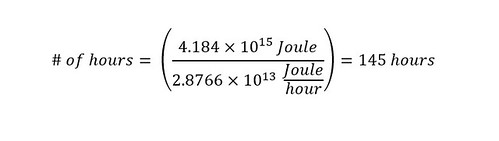
Knowing the difference between bombs is around 3 orders of magnitude, I can recalculate using the magnitude of a 'Hydrogen bomb' -- i.e., megaton -- which is shown below:


Wow!!! That is different.  Another way to compare the two values is to inspect the 'exponents' of the numbers in question.  In the case above, the two values of energy differ by two 'orders of magnitude'.  Which is to say, without performing the calculation, I could have just guessed that the difference would be around 2 orders of magnitude different.  I would not have been that far off.  These calculations show the power of exponents.  By inspecting the magnitude of the exponent, a good guess or approximation can be made.


Reality Check: Evaluating numbers is not as bad as you (the reader) might have thought!!!!!


How about a 2016 Nissan leaf -- how many miles can a person drive on 13 kilotons worth of energy?


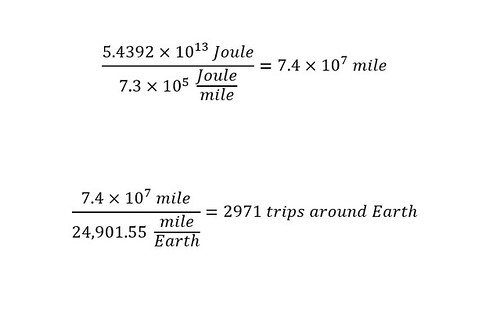
To carry out the calculation, the number of 'kiloWatt-hours' for a fully charged battery must be obtained.  I found a number -- 30 kiloWatt-hour -- which will supply enough power to drive around 150 miles.  As noted above, in order to make a direct comparison of energy, all values must be expressed in the same units.  Therefore, I will first convert the power to operate an electric vehicle (in this case a Nissan leaf) for 150 miles -- which is equal to 30 kiloWatt-hours -- to Joule per mile.  The conversion is shown below:


The calculated amount above is the amount of Joules needed to drive a Nissan leaf 150 miles.  From the calculations above comparing the power consumption of Los Angeles county, a guess can be made just by inspecting the difference in exponents.  Comparing a power of 13 to that of 5 will produce a LARGE number of miles.  In order to make sense of a large number, I need a large distance...How about the distance around planet Earth?


Lets recast the above question to the following:


How many times would that power a Nissan Leaf to drive around planet Earth?


What is the distance around planet Earth?  According to the website 'Universe Today,' the distance is equal to 24,901.55 miles.  With a distance in hand, the same comparison (and calculation) from above can be carried out which is shown below:


Oh my goodness.  Now the energy contained within a 13 kiloton nuclear weapon seams large.  So does the amount of power consumed on an annual basis by the entire county of Los Angeles.  Wow.


Last but not least, I could not leave without choosing an appliance that a majority of people can relate to.  I mean, if you do not live in Los Angeles county or have never visited, then the first calculation might be difficult for you to grasp.  Alternately, if you do not have an electric vehicle or do not know anyone who owns one, the second calculation might be meaningless to you as well.  Plus, electric vehicles are supposed to be efficient -- which would lead us to expect a vehicle to get a 'great amount' of miles out of a given 'battery charge.'


How about a ceiling fan?


A ceiling fan is common here in US households.  My ceiling fan is loud and keeps me awake when I have to resort to using the damn fan during the hot summers.  Lets end this blog post by calculating how long a ceiling fan could run (be powered) for running solely off of 13 kilotons of energy?  In order to compare values, the power to run a ceiling fan must be determined.  How do we get that?  Look on the internet....I found an answer provided by 'Duke Energy' on a website that lists a variety of home appliances in units of 'kWh/hour' or 'kWh/month'.


According to Duke Energy, the power needed to run a ceiling fan for one hour is 0.075 kWh.  I followed the same procedure as above to determine how long the ceiling fan would run for off of 13 kilotons.  Note: since we know that the electric vehicle was able to circle the planet Earth nearly 3000 times, we can guess that the amount of time will be even larger in magnitude.


As a result, I chose to express the amount of time in years.  Here are the calculations below:


Wow.  As expected, the amount of time is extremely huge.  A ceiling fan could be operated for 23,000 years off of 13 kilotons worth of energy.  That is amazing.  Have you realized yet that the amount of energy contained within a small nuclear weapon -- around 13 kilotons -- is actually a huge amount of energy?


Are we done here?  I think so.  Here is an assignment for you (the reader)....


Conclusion


Obviously, if you have read through the entire post above and worked through the calculations, the energy has been realized to be quite large.  As a conclusion, I will keep the wording simple.  I would challenge you to choose different quantities of energy and compare them to 13 kilotons by yourself.  Leave the results in the 'comments' section below.  And last but not least, have fun.  I hope that in the future you will look at the concept and reporting of a nuclear weapon in a completely different light.  Have a good night!

Tuesday, January 5, 2016

How Many Smells Can Humans Differentiate Between?


Note: This post was originally written last year.  Enjoy the article!!


Last Thursday, I rode a new route by bicycle home from work which entailed riding longer >22 miles (and in the heat) instead of using my normal dominant mode of transportation — the metrolink commuter train. The previous weekend, my wife and I discovered a new bicycle path that passes (in a round about way) our work. At the time, I was excited and said “I am going to ride this route home at least once this week” — today was that day–Thursday. On my ride I could not help but think about two articles that I read recently–one from a newspaper and the other from an academic journal detailing a study of odor differentiation. In short, turns out that humans have around 2.5 million sweat glands in distributed strategically throughout the surface of the body (to stabilize the body temperature) and all of these were working today in concert on my ride home–I was sweating a large amount. At the same time, I was giving off “chemical signals” without even knowing during which I was telling a story inadvertently to the surrounding species (fellow riders, runners, walkers, cars w/windows down, non human species included).


Why is the above any concern to the reader of this blog post? Maybe the discovery is not and simply boring and is reason enough to stop reading now (fair enough). If the reader is interested how these ‘chemical signals’ are correlated with the ability to distinguish our partner’s various states of odor (stressed, happy, nervous, sexual, etc.), then keep on reading. Furthermore, if you would like to know why this should not be of any surprise due to recent scientific findings regarding the ability of the human to distinguish between various smells (including complex overlapping of smells), then this post is for the reader to use as a springboard to read more into the scientific and non-scientific literature and form ones own opinion on the matter. In addition, you can perform your own experiment on yourself to test the findings. Or, simply just go back in time in memory and think about various odors that have been observed on a partner at a given time.


2.5 million sweat glands and chemical signaling?


As I mentioned above, I was sweating profusely on the ride home on my bicycle this evening which made me think of an article that I read in a newspaper. According to the ‘Los Angeles Times’ article titled "Sweat: A Cooling System That’s An Ancient Language Too," the human body has more than 2.5 million sweat glands across our surface. These glands provide an avenue for releasing large amounts of water (some people up to 3 gallons per day) which is surprising in itself–unless you are an athlete–wrestler, boxer, martial artist, etc.. I was not too surprised at this number–in fact I would not be surprised if this is a low value of the true number of total sweat glands. What caught my eye is contained in this excerpt from the article:


Sweat itself is 99% water, with traces of salts and metabolic wastes. When secreted onto the skin’s surface, sweat evaporates, taking heat from our bodies as it vaporizes and cooling the blood that flows beneath our skin. This evaporative cooling system is likely the reason that human bodies are nearly hairless. And it turns out we can thank our efficient sweat glands for the trait that makes us uniquely human: our big brains.


I started to wonder if the percentage of water varies based on diet and exercise regimen. When I go out for a ride–like the one that day–and I have not been on my bicycle in a short time–I tend to sweat a large amount of salts and other chemicals. The direct observation of not being able to see is the indicator along with wiping the sweat away and the next drop blinding me more than the previous drop. Therefore, I need to look into this number a little more and will report back in a future blog. The importance of the observation was more tied to the next excerpt below:


Humans have two types of sweat glands: eccrine glands, which are distributed evenly throughout the body, and apocrine glands, which are densely packed in the underarm, genital and nipple regions. Apocrine secretions are milkier than eccrine secretions and are friendlier to bacterial growth.
“Sweat doesn’t have much smell itself, but when apocrine secretions and microflora meet, it gives a unique smell,” says Denise Chen, professor of neurology at Baylor College of Medicine in Houston who studies the nuances of our unique body odors.
Interested in how married people seem to understand each other without words, Chen and colleagues recruited couples, then used armpit pads to collect sweat from each individual in different emotional states: fearful, happy, sexual or neutral. Next, individuals blindly judged the sweat samples of their partner as well as the opposite-sex strangers in the group. The study found that individuals were significantly more accurate in distinguishing their partner’s emotional sweat from his or her neutral sweat than they were in distinguishing the emotional sweat of a stranger. And their accuracy was directly related to how long they had been in the relationship.


The article suggests that humans give off chemical messages as a result of sweating throughout the day. Should this be surprising? Not really, research conducted a few years back found that sweat did indeed contain more than just water–including metabolites and other chemicals. If one takes a step back and just thinks about him/herself and their own various body scents during a given occasion (sex, stress, various emotional states, etc.) none of this should be surprising. How many people just avoid thinking about the topic all together and just hit the stick of deodorant for a ‘freshen up’ application layer? I know that I do occasionally during various moods to hide the chemical language that I am giving off.


At first glance what surprised me most was that my wife could distinguish (according to the study in the article) various moods by my odor. Of course, she has other indicators through other senses (visual and audio) that completes her assessment of her experiment. I started to think back to various time points in our relationships when I remembered distinct smells and tried to remember if I could have correlated that odor with a mood. As a disclaimer–I would not suggest starting to collect your spouse’s or partner’s clothing after various moods and writing observations down–as this act might raise a ‘red flag.’ I simply did a thought experiment with no actual verification on my own wife–just to clarify.


The last sentence of the above excerpt (second one) makes logical sense in that humans form memories of observation (of all the senses) at various times in our relationship. Further, the more we reinforce a given scent with a mood–(length of time in a relationship)–the easier it should be able to identify the scent. If you have ever gone wine tasting, your ability to distinguish scents is extremely powerful–even when scents are masked. With this last sentence in mind, I was led to think of a recent article that I read in the Journal ‘Science’ a couple of months ago. The research was concerning the span of odors that make up the range of the human olfactory system. How many different odors can humans distinguish between? And does this number have any correlation with the above statements regarding differentiation between spouse’s moods based on odor exlusively?


How Many Smells Can Humans Differentiate Between?


The human olfactory system is differs greatly from the other senses (visual and audio) in the range of differentiation of various smells. Recently, the realization has been researched into more depth by scientists in the United States and Europe in a collaborative effort as highlighted in a recent article in the Journal ‘Science’. The title of the article is "Humans Can discriminate More Than 1 Trillion Olfactory Stimuli". To really absorb the methodology of the experimental research, I would suggest pouring over the paper itself. In the article, the authors distinguish–quite coherently–the difference in between the various senses in terms of the range of the human sensory system (visual, audio, and odor). Here is an excerpt from the beginning, defining the problem:


To determine how many stimuli can be discriminated, one must know the range and resolution of the sensory system. Color stimuli vary in wavelength and intensity. Tones vary in frequency and loudness. We can therefore determine the resolution of these modalities along those axes and then calculate the number of discriminable tones and colors from the range and resolution. Humans can detect light with a wavelength between 390 and 700 nm and tones in the frequency range between 20 and 20,000 Hz. Working within this range, researchers carried out psychophysical experiments with color or tone discrimination tasks in order to estimate the average resolution of the visual and auditory systems. From these experiments, they estimated that humans can distinguish between 2.3 million and 7.5 million colors (1, 2) and ~340,000 tones (3). In the olfactory system, it is more difficult to estimate the range and resolution because the dimensions and physical boundaries of the olfactory stimulus space are not known. Further, olfactory stimuli are typically mixtures of odor molecules that differ in their components. Therefore, the strategies used for other sensory modalities cannot be applied to the human olfactory system. In the absence of a straightforward empirical approach, theoretical considerations have been used to estimate the number of discriminable olfactory stimuli. An influential study from 1927 posited four elementary odor sensations with sufficient resolution along those four dimensions to allow humans to rate each elementary sensation on a nine-point scale (4). The number of discriminable olfactory sensations was therefore estimated to be 94 or 6561 (4). This number was later rounded up to 10,000 and is widely cited in lay and scientific publications (5–7). Although this number was initially calculated to reflect how many olfactory stimuli humans can discriminate, it has also sometimes been used as the number of different odor molecules that exist, or the number of odor molecules that humans can detect. We carried out mixture discrimination testing to determine a lower limit of the number of olfactory stimuli that humans can discriminate.


From the research described in the paper, the number that was determined to accurately discriminate between odor mixtures of molecules was cast with a lower bound of 1 trillion. As discussed in the accompanying interview with the authors on the ‘podcast’ from the website ‘science,’ this number is most likely going to be a ‘low-ball’ estimate. The authors believe that in time the number will soar into the tens of trillions with emerging research in the future regarding odor discrimination. A reader of this blog might be asking “how did the researchers approach testing for odor discrimination in subjects. Here is an excerpt describing the thought behind the actual experimentation (which I leave to the reader–to access the Journal Article and devour at one’s own speed) below taken from the article:


Natural olfactory stimuli are almost always mixtures of large numbers of diverse components at different ratios. The characteristic scent of a rose, for example, is produced by a mixture of 275 components (8), although typically, only a small percentage of components contribute to the perceived smell. We reduced the complexity by investigating only mixtures of 10, 20, or 30 components drawn from a collection of 128 odorous molecules (table S1). These 128 molecules were previously intensity-matched by Sobel and co-workers, which enabled us to produce mixtures in which each component contributes equally to the overall smell of the mixture (9). The 128 molecules cover much of the perceptual and physicochemical diversity of odorous molecules (10–12) because the collection contains most of a collection of 86 odorous molecules that were selected to be well distributed in both perceptual and physicochemical stimulus space (9).


The researchers tested a variety of mixtures to see the ability of the volunteers to distinguish between mixtures with a varying amount of “overlapping” of odor molecules. By this, the researchers varied the percentage of different odor molecules in each mixture. From this research, the reader then should not be surprised at the above results reported in the study highlighted in the ‘Los Angeles Times’ newspaper. One might be asking the obvious question “Who cares?” The importance of the research introduced above lies in the ability of scientists to push the boundaries of hypothesizing and framing the problem. In this study, a mixture of two odors would compose a single dimension. On can imagine then a multidimensional mixture of 20 different odors. That is, the resolution is cast into multiple dimensions when compared to single dimensions when studying other senses. That is, when one is studying an audio problem, the dimensional analysis is defined in terms of ‘tones’–which is cast into a single dimension. Similarly, in a visual study, the single dimension is defined in terms of wavelength of light. Before this study, either of these senses were cast into a single dimensional space.


Science has progressed to expand our thinking of odor discrimination and continues to grow. The research highlighted in both examples above is fascinating and shows the rapid improvements in study design and experimentation along with the interpretation of the given results. Further, when one is out in nature from now on, there will be extra dimensions to explore with your sensor (your nose). I was enlightened by learning about the above research and the new found knowledge definitely changed the experience of my ride home last Thursday. In addition to odor discrimination, there is a large amount of untapped knowledge regarding chemical sensors/signaling which is encountered in nature on a day to day basis. This should be motivation enough to continue to push the boundaries of designing/building better sensors as technologies progress to try to match a small fraction of the ability of the human sensory system. There is no doubt that scientists have a LONG way to go before competing with the human sensory system. At the same time, current (progress) results are exciting and should be celebrated both in and out of the laboratory.

Friday, January 1, 2016

Does a Golf Ball have more than one shape (round)?

On the first reading of the title above, one might be wondering what is meant by the question?  Is a golf ball not round?  If I were to holding a golf ball (brand new) in my hand, the shape would appear to be round from all angles.  Lets change the wording of the question.  Does a golf ball take on more than one shape during a game?  By most accounts (visuals), the answer should be no.  A golf ball seems 'rigid' and 'round'.  In the post below, I will show evidence that indeed -- a golf ball can take on more than the usual 'round and rigid' shape.  Last but not least, I will shed light on the basic flight dynamics of the golf ball.  After reading the blog post, the simple sight of a golf ball will bring new thoughts to mind.


What is the shape in slow motion?


A video was floating around on social media that caught my attention and served as the subject matter of this blog post.  Shown below is a short video (less than 40 seconds) of a golf ball hitting a steel plate at 150 miles per hour:


Does the video seem strange to you? The video is in 'slow-motion.' The video has been 'sliced up' into 70,000 frames per second. I realize that the reader (you) might be confused by 'slicing up' a video into thousands of frames per second. The process is referred to as changing the 'frame rate.'  The process is accomplished by filming the event (in this case using a 'high-speed' camera) with a special camera. Traditional film (movie film) is viewed at around 24 frames per second. To understand the concept further, see the diagram below. I found this diagram off of a 'branching' search.


Source: 


The basic idea is to 'slice up' time into smaller pieces.  In the diagram above, the bottom line could represent 1 second of film.  The next line up would divide the 1 second of film (represented by 1 frame) into two frames -- line 2.  Further dividing the film would result in line 3 with the original 1 second (1 frame) divided into 4 frames (still 1 second in total time duration).  In the very top line, the maximum divisions is now 8 frames in 1 second.  Are you confused yet by my choice of diagram and description?  I understand completely.


How about another route (diagram) to convey the same concept of changing the 'frame rate.'  Below is a more appropriate representation taken from a animation website:


Source: https://www.codeaurora.org/blogs/mbapst/measuring-fps-web


In the diagram above, one second of animation is expanded into 60 frames. Some people (opinions) think that the video above of the golf ball hitting the plate is fake. Specifically, that the motion (deformation) of the the golf ball throughout the flight is unbelievable. More specifically, that the deformation upon rebound is not possible.  Is the opinion possible?  Sure, why not. But.


As a chemist, I would reserve my judgment until I can absolutely disprove the video with further evidence.  On a different note but similar in concept, every day matter (molecules, bulk material) appears to be 'rigid' and 'sturdy'.  If the same material was viewed on a different length scale, 'perturbations' might be visible that were not evident at the previously viewed scale.  One of the many beautiful aspects of science is that molecules (or bulk matter) is not static as it appears on the 'classical scale'.  (More about this in a later post!!!)


I looked for another video to confirm the above motion. I found one -- which is shown below of a golf ball hitting a metal golf club at 150 mph filmed with a frame rate of 40,000 frames per second:


Regardless of whether the golf ball deforms to the extent upon impact as shown in the first video, the fact that the visualization is possible is amazing.  Technology has advanced tremendously and allowed golf ball research to advance 'leaps and bounds.'  Is any motion other than a 'rigid' ball possible during a golf game.  And yes, their are instances where a golf ball will encounter (impact) a hard metal surface.


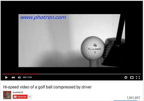
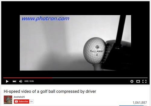
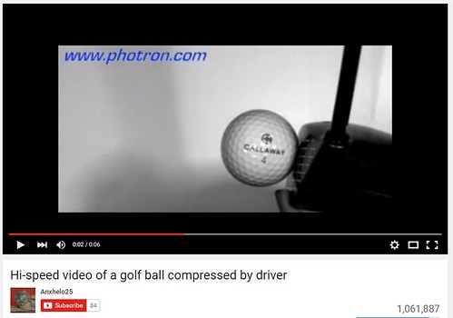
There are slight deformations that a ball undergoes during a golf club swing.  Technology has allowed the deformation to be visualized.  I have cut up or taken apart (into still pictures) the compression of a golf ball by a driver.  Below are the photos -- which show deformation:


Before Impact


During impact!


After Impact!


Captured in the middle photo is the deformation or compression of the golf ball.  This is maximum compression.  After the golf ball leaves the impact, there is a visible 'deformation tail' -- slight deformation of the ball.  None of this would have been possible without the use of a high-speed camera.  What about the composition of the golf ball?  What chemical aspect allows the ball to undergo the compression's seen in the frames above?


What is a Golf Ball made of?


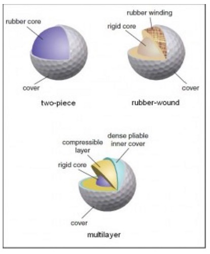
In order to  understand the compression (or deformation) that a golf ball adopts during a game, I probably should give a basic over view of what a golf ball is made of.  When I decided to write the post a few days ago, I had not understanding of the composition of a golf ball.  I would have guessed along the lines of the the center (of the golf ball) being a rubber core and then rubber winding's layered up until a 'hard core.'


To find the answer, I conducted a Google search and of the many results, one stood out.  The University of Utah sports department has a blog, "Sports 'n Science", where questions regarding sports are answered.  And the answers are comprehensive to say the least -- which I respect and love.  In one post titled "Creating The Perfect Golf Ball With Chemistry (Basics)," the author describes the composition of a golf ball in a general manner:


The first modern golf ball consisted of a small, hard core wound with a long string of rubber and then coated with tree gum called gutta-percha (Mallon, 2011).   Since then, many improvements have been made on golf balls to give them the perfect “feel” (i.e. a certain resilient, soft feel that golfers look for when their clubs make contact), but also great durability and wear and tear resistance. These two qualities tend to be mutually exclusive in a single material; however, scientists have developed balls with several layers, each layer addressing a specific need that the ball has.
Researchers have targeted polymers, a long molecular chain made of many smaller subunit molecules linked together, as the best materials for golf balls. This is because polymers are very flexible – by changing even one atom in the subunit or twisting the subunit slightly, a polymer can go from being used for the hard golf ball cover to the more elastic inner layer.


 The descriptive history leading up to the crucial parameter of choosing a 'polymer' with unique properties provides us with the essentials of the golf ball.  As a chemist, I especially enjoyed the fact given that by changing even a single atom in the subunit will change the spatial features of the golf ball.  Furthermore, the entire performance of the golf ball will change as a result of what appears to be a small change in composition (chemistry).


These changes result in different flight dynamics in a golf ball.  The author goes further to explain a critical feature of a golf ball -- the ability to withstand a large amount of force upon impact:


Golf balls have other important pieces to them, such as the cover. The cover of a golf ball must be able to withstand up to 10,000 N (Penner, 2003) of force without cracking and also be able to take repeated hits without wearing down. The entire ball must be able to snap back into its original shape without any damage to itself or its properties from the momentary deformation that occurs when it is hit with the club. The ideal ball would have a perfect transfer of energy between the club and the ball, so that none of the golfer’s force is wasted.


A golf ball is required to absorb a large amount of force -- 10,000 N.  An equivalent force is:   In another blog post titled "Creating The Perfect Golf Ball With Chemistry (Technical)," a diagram of the structural makeup of the golf ball is shown:


Source: University of Utah -- "Sports 'n Science"


As you can see, the structure of the golf ball is relatively simple.  The chemistry inside can very to a large extent, but that would also have dramatic changes to the flight dynamics.  What other aspects make up the structure of a golf ball?  The dimples on the surface of the golf ball are the remaining parameter which have a large effect on the the flight dynamics.  This observation led me to ask the following question -- which makes up the remaining section:


What is the purpose of the dimples on the surface of the golf ball?


Surprisingly enough, the dimples have a HUGE effect on the flight dynamics of a golf ball.  During my search into the structure of the golf ball, there were two videos on the dynamics of golf balls.  Both videos relate the structure of the golf ball to the dynamics.


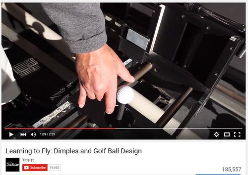
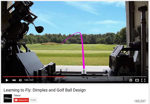
The first video was produced by the golf products company 'Titleist'.  The title of the video is "Learning To Fly: Dimples And Golf Ball Design."  I found the video super informative but brief.   I love the demonstrations (or simplicity of examples) that show the effects of 'dimples.'  The narration of the video is by Nick Nidarcci, Senior Project Manager of Aerodynamics at 'Titleist.'  Below is a series of "still slices" of the video to illustrate the point of having dimples.


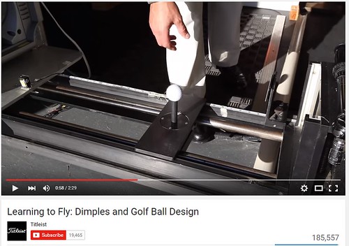
In the first picture shown below is a golf ball that is manufactured to illustrate the effects of dimples on the surface of the ball.  The golf ball in the picture has only half of the surface covered with dimples.


The ball was placed into an automatic golf dispenser at the Research Center for the company 'Titleist'.


If dimples have no effect on flight, then the ball should go straight.  In the above picture, the side of ball with dimples is placed on the right side (facing the field).  Below is the flight path of the ball outlined by a pink line:


The dimples provide a 'pull' by reducing the turbulence on the surface of the ball.  Before I show some diagrams (which are still frames of a video on the physics of golfing), proof can be revealed by showing the orientation of the 'half dimpled' ball reversed.  If the 'dimples' on the surface of the golf ball do in fact provide a 'pull' on the ball, then the trajectory should be reversed.  That is, the golf ball should veer off toward the 'left side' of the range, rather than the 'right side' as shown above.


Shown below is the golf ball being inserted into the automatic golf ball dispenser with the 'dimples' facing the 'left side' of the range.  


Here is the path after the automatic club has hit the ball...


As shown, the 'dimples' do in fact provide a 'pull' to the surface of the golf ball.  The two different orientations of the 'half dimpled' ball along with the two different paths (left vs. right) raises the following question:


How do 'dimples' on the surface of a golf ball provide 'lift'?


Right about now, the blog post might be too lengthy....Right?  Well, to finish up, I will try to be very quick.  The video by the golf products company 'Titleist' was informative as is the current video by the US Golf Association (USGA).  The video produced by the US Golf Association titled "Science of Golf: Why Golf Balls have dimples?"


Both of these videos are made well. Both are extremely informative and can be easily overlooked.  The rich material in them was thought out well and is appreciated by people (chemists/scientists) like myself.  I love a great video which is simple and makes me think.  Further, the videos convey complex dynamics super easily.  Below is a short tutorial of the video (still slides) with brief explanations from me.


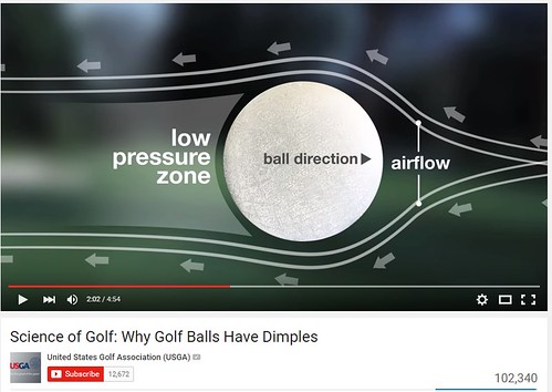
The first slide shows the airflow around the surface of a golf ball.  Air is moving across the surface from right to left -- as shown by the arrows around the ball:


As the air flows over the surface of the golf ball there is a turbulence that is created.  The turbulence is 'shifted' toward the back side of the ball (during flight).  This produces a 'low pressure zone' where all of the turbulence produced by the airflow resides.  What is wrong with this picture or effect?


The problem with having the turbulence in the rear of the ball during flight results in two negative aspects of flight: drag and pull.  Drag is the result of the turbulence in the rear of the ball.  The drag results in a 'reverse' pull.  Think of the effect as 'lift' in reverse -- that is 'lift' pulling the ball toward the 'left' (in the frame above is viewed as the reverse direction of flight).  The overall effect of these two aspects is that the golf ball is slowed down.


What can be done to reduce the drag and pull?  What can be done to reduce the turbulence at the rear of the golf ball?


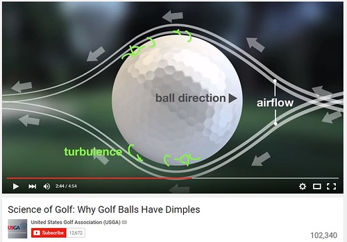
To answer the two questions above, another question needs to be raised regarding the turbulence at the rear end of the golf ball during flight: What if the turbulence could be distributed around the surface of the golf ball?  Meaning, if the turbulence were distributed around the surface of the ball, would the overall turbulence be reduced?  Turns out that the answer to the second question is yes.  To reduce the drag and pull, researchers in the aerodynamics research groups at large golf company's devote a large amount of effort toward distributing turbulence across the surface of the golf ball.


What does the distribution of turbulence over the surface of a golf ball look like?  Here is a picture of the effect below from the USGA video:


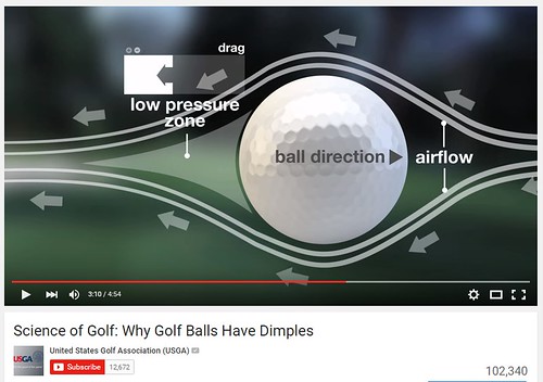
The illustration is difficult to view.  In the diagram above, the small fluorescent green markings on the surface of the golf ball represent the turbulence.  Now, the 'width' of the tail end of the airflow is reduced.  The reduction is the result of shifting the turbulence over the surface of the golf ball.  In the diagram below, the total effect (reduction of drag and pull) is shown:


The airflow on the rear end of the golf ball is greatly reduced.  Therefore, the drag and pull are reduced too.  The result is a faster flying golf ball with greater 'lift' similar to an aircraft wing.  The upper lift is dominant due to another effect (which I refer to more information) -- the Magnus Effect.  A golf ball in flight spins which give rise to an effect of lift:


The Magnus effect is the commonly observed effect in which a spinning ball (or cylinder) curves away from its principal flight path. It is important in manyball sports. It affects spinning missiles, and has some engineering uses, for instance in the design ofrotor ships and Flettner aeroplanes.
In terms of ball games, topspin is defined as spin about an axis perpendicular to the direction of travel, where the top surface of the ball is moving forward with the spin. Under the Magnus effect, topspin produces a downward swerve of a moving ball, greater than would be produced by gravity alone, and backspin has the opposite effect.[1] Likewise side-spin causes swerve to either side as seen during some baseball pitches, e.g. slider.[2] The overall behaviour is similar to that around an aerofoil (see lift force) with a circulation which is generated by the mechanical rotation, rather than by airfoil action.[3]


For more information, I encourage the reader (you) to read up on the Magnus effect named after the physicist Dr. Gustav Magnus.  The concept of lift resulting from spin can be confusing to some.  That fact alone increases my admiration for the physicists and other scientists who devote their lives to understanding various phenomena to enrich our lives in a variety of ways (sports, technology, utility, etc.).


Conclusion


Have I carried on enough?  Did you learn enough from the blog post?  Is there anything I have left out that would have provided a more complete understanding?  There always is.  That is where you (the reader) comes in to fill the void.  Of course, this depends on the level of curiosity in your mind.


I leave you with a brief understanding and a few starting points (resources: videos and links) from which to launch your own investigation.  The exact parameters which dictate the flight dynamics of a golf ball can be quite complicated as has been alluded to above.  This is just a dip into the vast ocean of knowledge -- in which researchers in the golf industry are swimming in (metaphorically -- Research and Design) to make the golf ball and in the larger picture the golf game more enjoyable.  I encourage you to delve further by researching more and learning more about the dynamics of the golf ball.


I hope that you have enjoyed to post.  Happy New Year!!!!